
Web Redesign Project
Canada Council for the Arts
Project Overview
This case study focuses on redesigning the Canadian Council for the Arts website to enhance the experience for first-time users. By conducting extensive research, I identified pain points and developed a new, user-friendly interface to simplify navigation and enhance usability. The primary goal was to create an intuitive and delightful experience for new visitors, while aligning with accessibility standards and user-centered design principles, effectively highlighting the value of the new design.
My Role: UX Designer | UI Designer
Timeline: 3 Weeks

Research
User Research | Observations & Analysis

User Research
To define the scope of this project, I developed a Research Plan to conduct usability testing of the existing website design with potential users.
Research Objectives:
Identify obstacles faced by first-time users during the account creation process.
Assess challenges encountered by existing users when logging in.
Understand the difficulties users experience while applying for funding or grants.
Explore navigation issues users face, particularly within the Spotlight tab.
Research Plan:
Seven participants were selected based on the following criteria:
Age Range: 18-65 years.
Arts Affiliation: Individuals with diverse interests in the arts.
Technological Comfort: Participants with basic to intermediate proficiency in using digital devices and navigating websites.
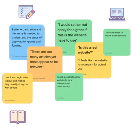
Key Insights from the Usability Testing:
Confusion during login and account creation arose from unclear buttons and a tedious setup.
96% users expressed frustration with website navigation due to excessive options and tabs.
98% were overwhelmed by extensive data walls.
Design inconsistencies significantly hindered the user experience.
Participants were unclear on how to start the grant application process.
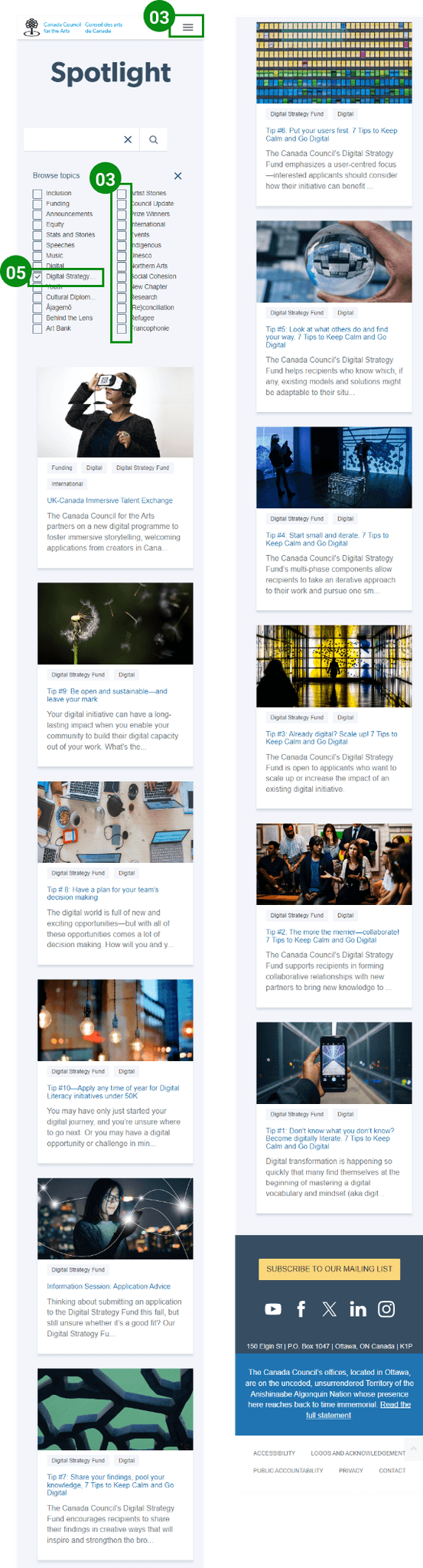
Users were overwhelmed by the amount of information, especially the spotlight page with excessive filter options.
Observations & Analysis
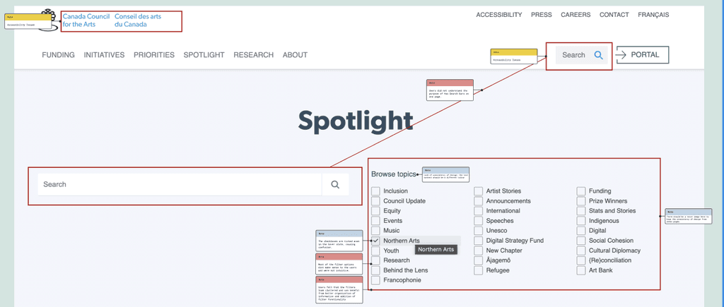
I conducted a UI Evaluation, which included both a heuristic evaluation and a color accessibility assessment, of the existing web and mobile designs to identify usability issues and areas for improvement.
Heuristic Evaluation:
Redundant features, including multiple search bars and confusing icons.
Inconsistent design elements across the website.
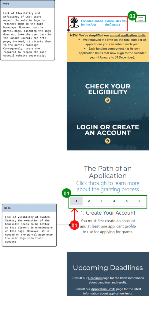
Lack of a highlighted user location indicator in the navigation bar.
Repetitive prompts during account creation and login.


Heuristic Evaluation - Desktop

Heuristic Evaluation - Mobile
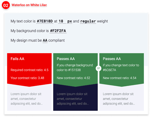
Color Accessibility Assessment
Inconsistent text colors across the website highlight the need for a more uniform approach to color usage and contrast adhering to the WCAG (Web Content Accessibility Guidelines).


Empathize & Define
Corrective Annotations | Feature Prioirtization | MoodBoard
Corrective Annotations
Using data from usability tests, heuristic evaluation, and color accessibility assessment, I began the ideation strategy.
By annotating key pain points from user feedback, I brainstormed design enhancements to improve user experience.
My main focus was to simplify navigation and encourage more artists to apply for grants and funding opportunities.


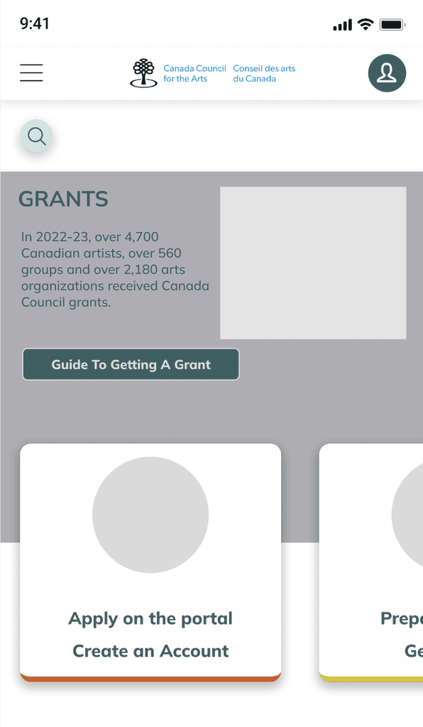
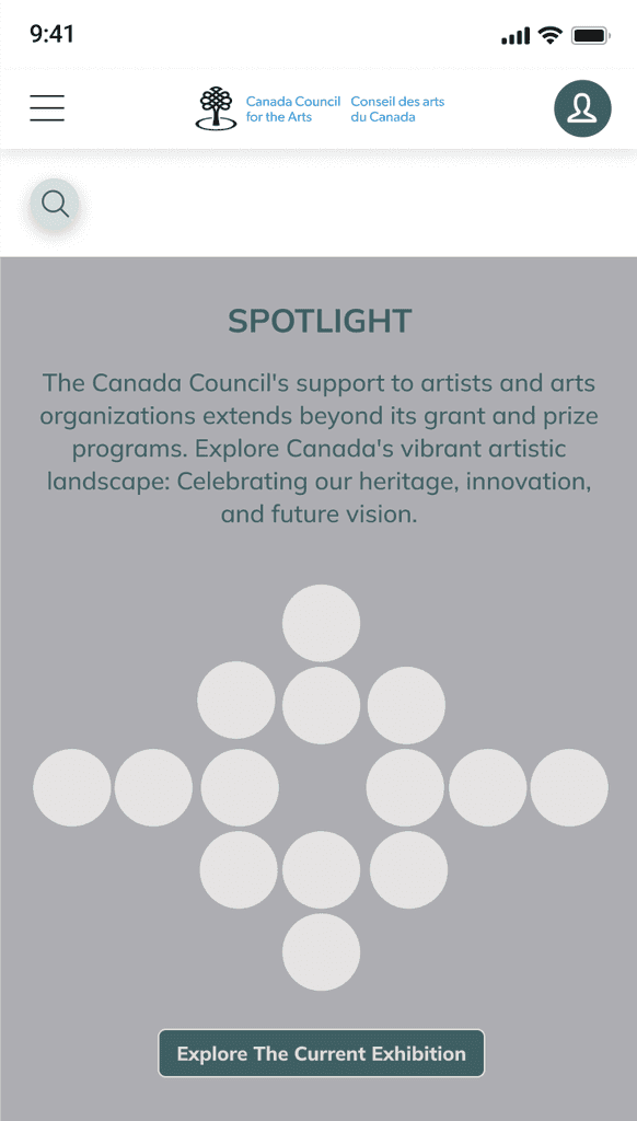
Mobile Prototype
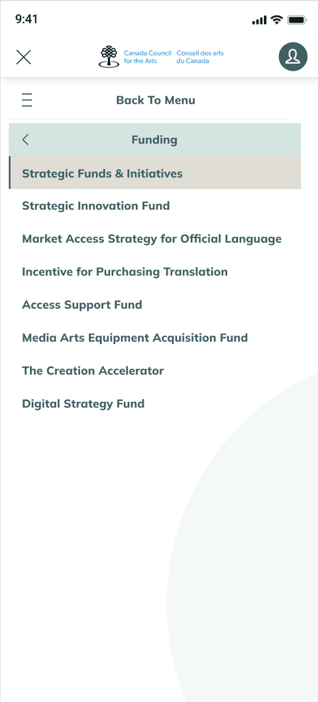
The mobile design features a hamburger menu that includes the login option, improving accessibility compared to the original design. Footer links have been removed from the hamburger menu and placed at the bottom of the main page for easier access.
The previous hamburger menu was cumbersome due to excessive dropdowns. The new design allows users to click on a tab to reveal its sub-tabs, with the option to return to the main navigation menu seamlessly.


In the wireframing phase, I translated the insights gathered from the research and ideation phases into low-fidelity wireframes. These wireframes focused on defining the structure, layout, and user flow of the website, ensuring that key features and interactions were clearly mapped out before moving into the visual design and prototyping stages.
My primary aim was to simplify the experience for new users by providing consistent design elements, ensuring that the layout would feel intuitive and second nature as users navigated between pages. This allowed me to focus on usability and functionality without getting distracted by visual details.
Additionally, I focused on translating this seamless experience to the mobile version of the wireframes, ensuring a smooth and cohesive user experience across all devices.

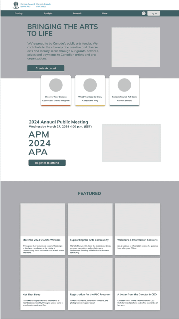
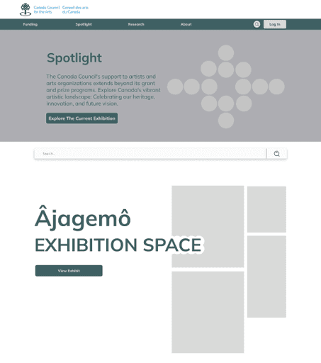

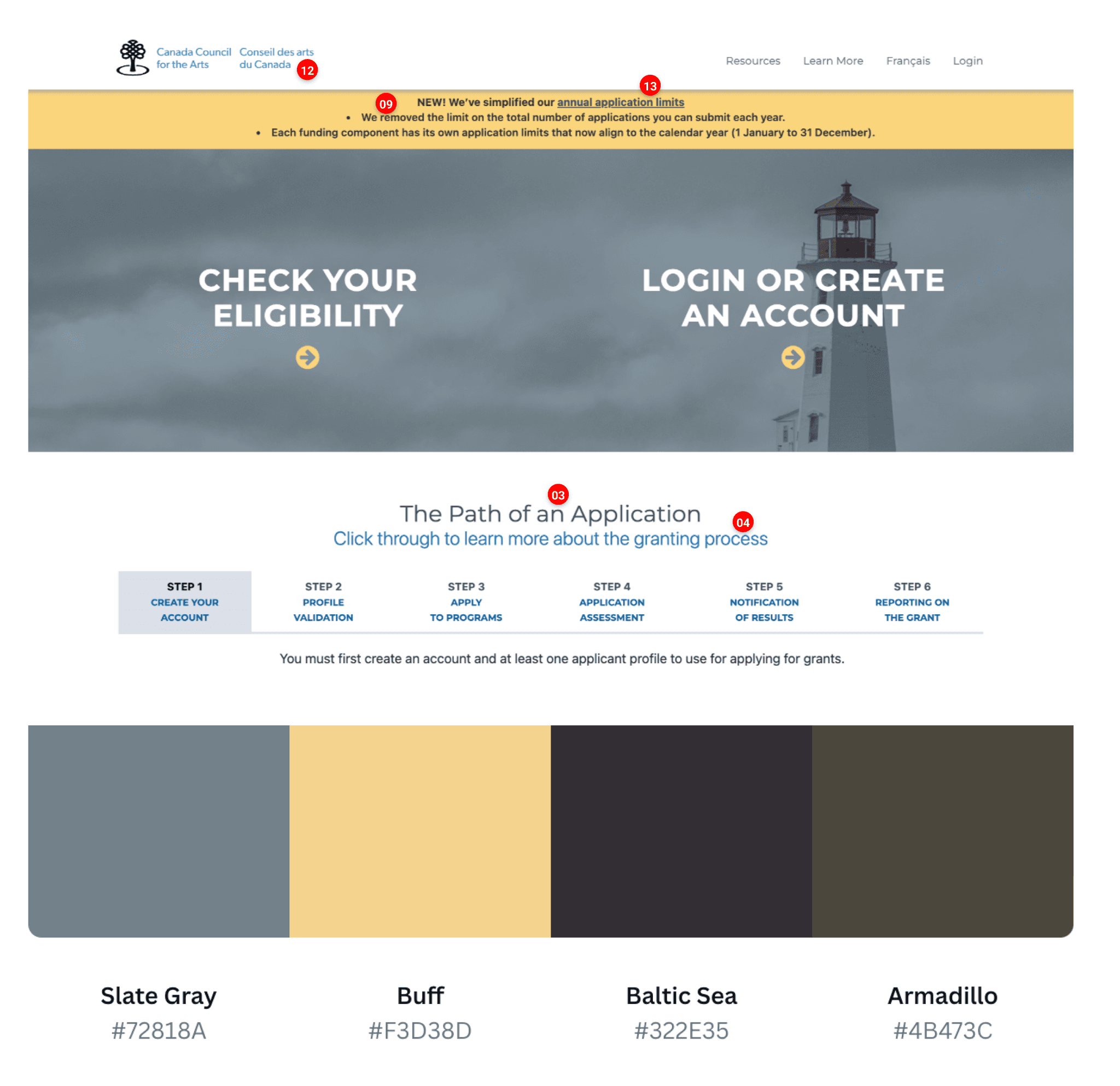
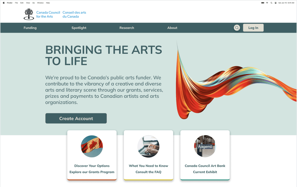
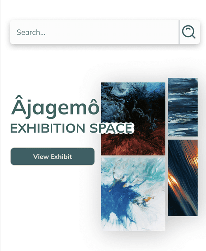
Desktop Prototype
The desktop prototype featured a robust layout prioritizing usability and accessibility, with advanced interactive elements like dropdown menus and hover effects to boost engagement.
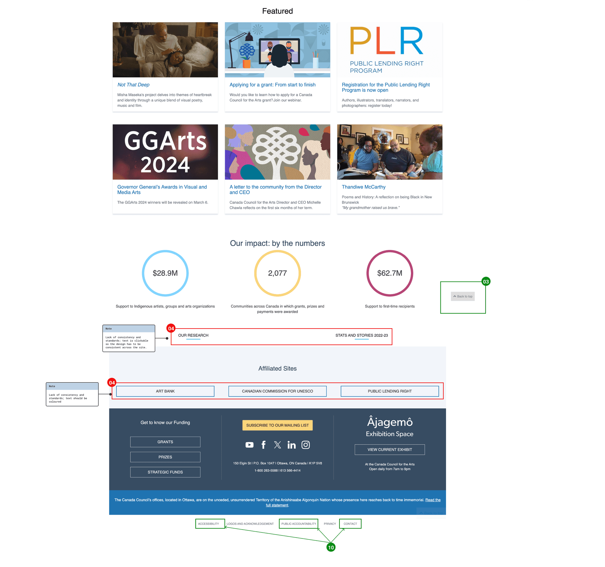
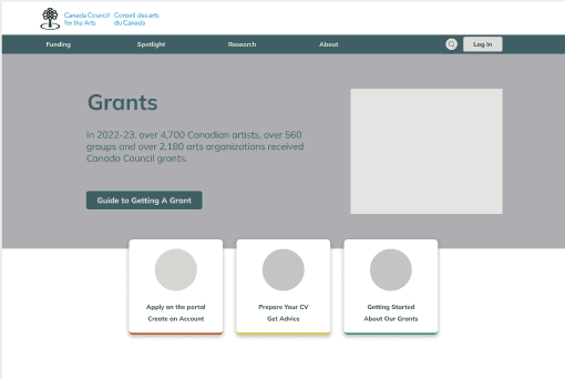
To improve navigation, the login portal was redesigned to stay on the same webpage, eliminating confusion from the original design, which directed users to a different site.
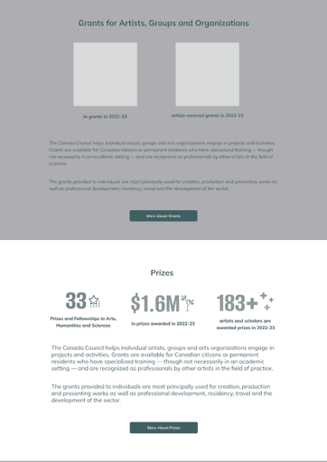
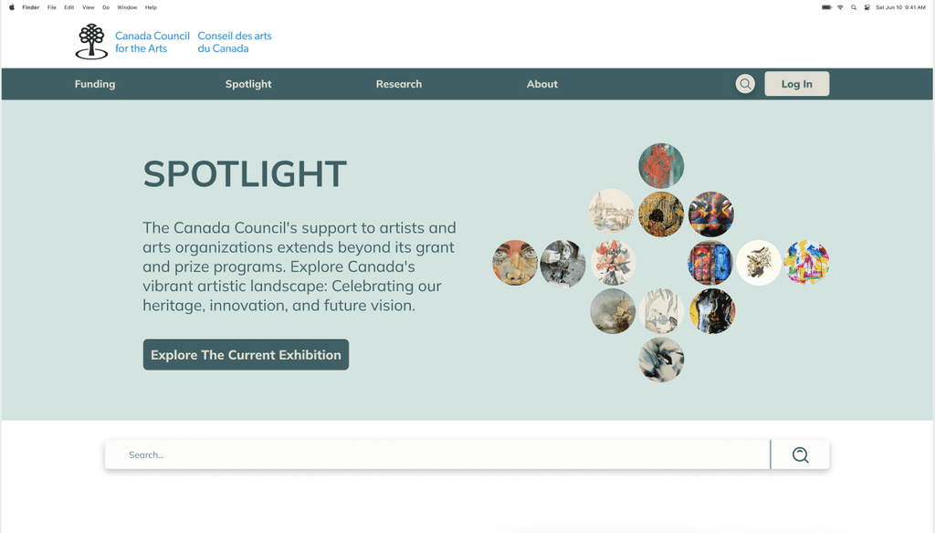
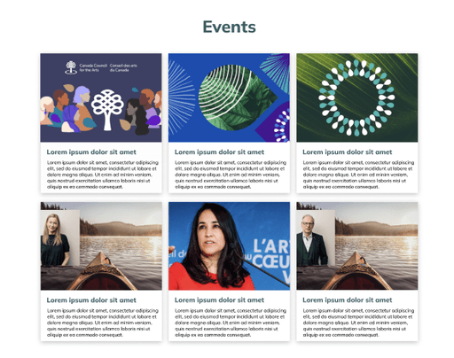
The Spotlight page was simplified and divided into sections, enhancing information absorption and allowing users to scan based on their interests. The previous design’s unnecessary filters cluttered the experience, distracting users from relevant content.
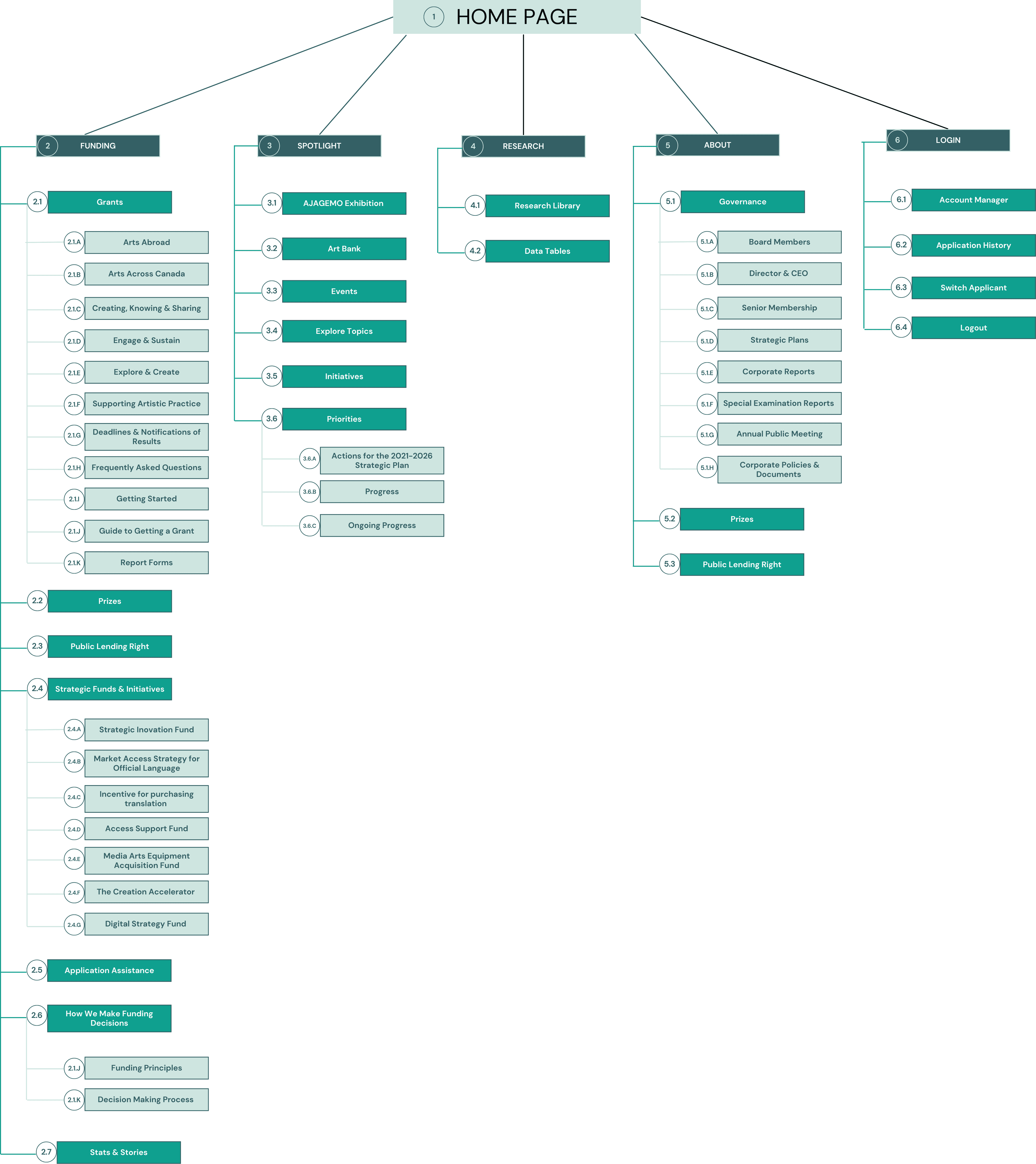
Card Sort & Site Map
To tackle user concerns regarding navigation and data redundancy, I utilized the card sorting method to reorganize the website's information architecture, resulting in a streamlined grouping of spotlight, initiatives, and priority pages.
Unnecessary tabs and redundant navigation bars were removed to optimize the user experience. Furthermore, I integrated the homepage and account portal into a unified web application to minimize data redundancy and facilitate smoother navigation.
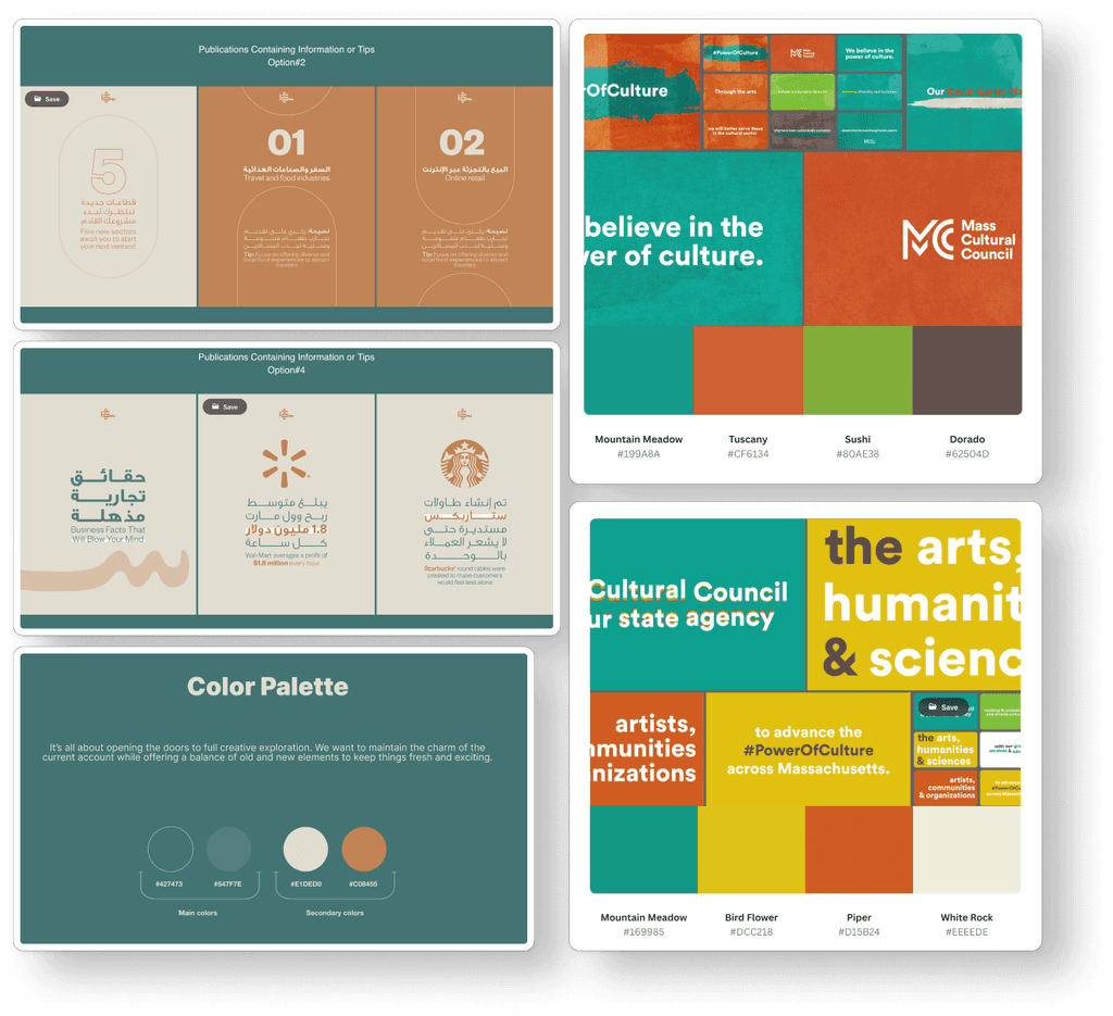
MoodBoard
To conclude the brainstorming process, I curated a mood board to inspire my wireframing and prototyping phases for the redesign. My inspiration centered around UI designs, UI patterns, color palettes, and typography.


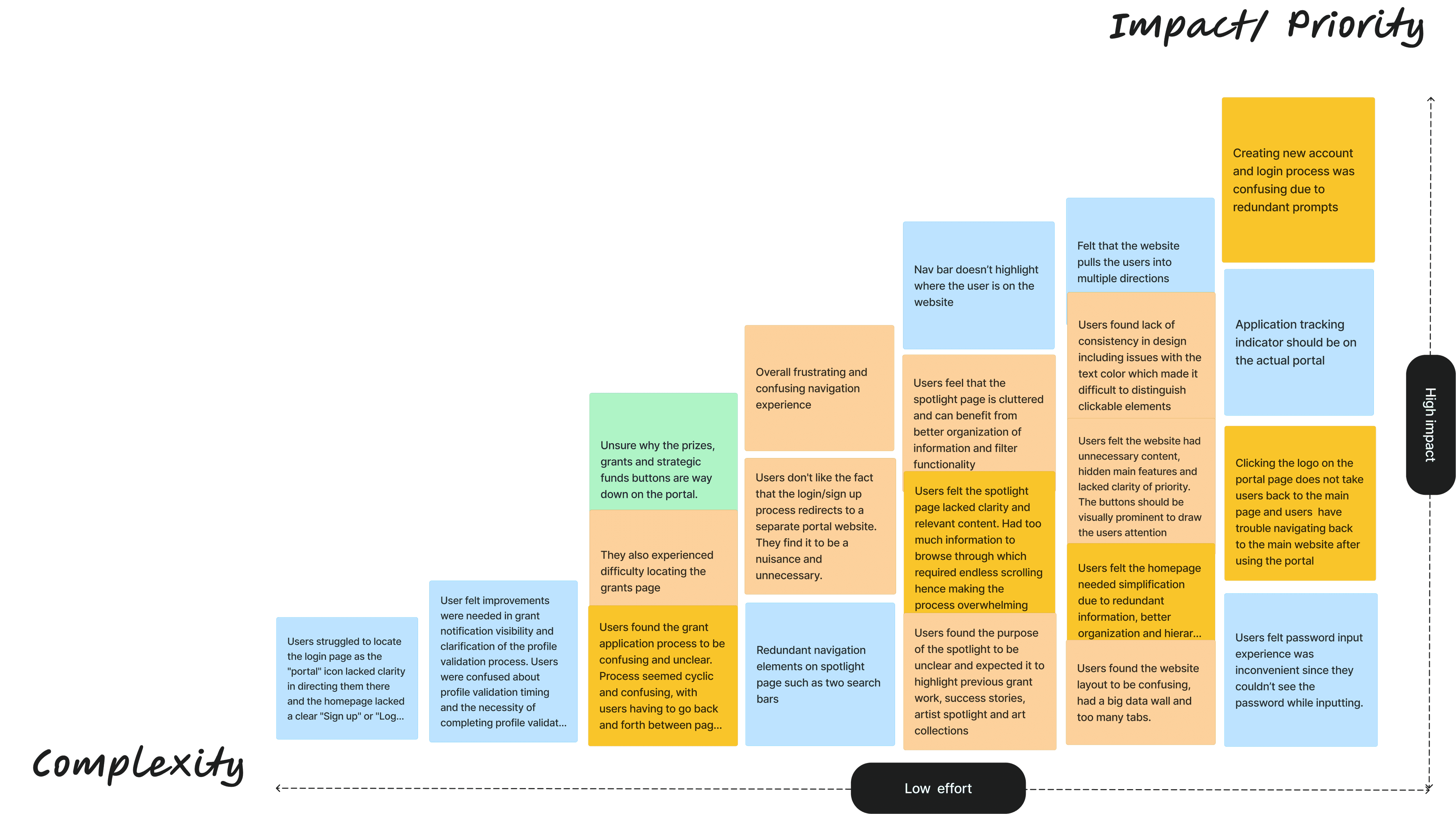
Feature Prioirtization
I used a feature prioritization matrix to systematically prioritize user feedback based on impact and complexity.
This approach allowed me to identify recurring patterns in user responses and focus on the most critical areas for improvement.
By organizing feedback according to response frequency, I was able to address the most common pain points efficiently, ensuring a more user-centered redesign.
Wireframing
Lo-Fidelity Wireframes - Desktop & Mobile
High-Fidelity Prototypes
In the Prototyping & Testing phase, I transformed the low-fidelity wireframes into interactive, high-fidelity prototypes that vividly showcased the final design vision. These prototypes were infused with real content, visually striking design elements, and dynamic interactive components, creating an immersive simulation of the user experience.
Usability Testing
After finalizing the prototype designs, I rigorously assessed user needs through a series of usability tests to ensure optimal functionality. This included three usability tests focused on evaluating users' ability to navigate both the web and mobile prototypes seamlessly.
Additionally, I conducted four Five Second Tests to address key questions:
What is your first impression of the page?
Can you identify the website's purpose?
User feedback revealed that the redesign greatly clarified the website's purpose. While users effectively navigated the clickable prototype. Users completed the test in an average of 4-7 seconds, despite it being designed for 1-2 minutes, showcasing their ability to navigate the site efficiently and highlighting that the navigation labeling is clear and concise.


This project was an incredible opportunity to tackle user challenges through thoughtful design. The redesigned Canada Council for the Arts website enhances usability, accessibility, and delivers a more cohesive user experience.
By incorporating clear design patterns, simplifying navigation, and using heuristic evaluations to address potential issues early, I created a more intuitive and user-friendly site.
If I had the chance to continue post-development, I'd implement analytics to track user engagement, providing insights for future improvements. Overall, this project strengthened my passion for crafting user-centered designs that offer seamless, meaningful experiences.
Final Thoughts
Prototyping & Testing
High-Fidelity Prototypes | Usability Testing | Future Considerations
All content on this site is the creation and property of Ayra Malik.